Have you ever visited a website on your mobile device and the page is not laid out right or the text is too small to read? That is because the website was not responsive. A responsive web design can make or break your business. It provides trust, authority and brand awareness.
Contact us to develop your state of art responsive web site in Qatar
What Is Responsive Design?
Responsive web design is an approach to creating a website that allows it to work on any device; whether it’s a mobile phone, tablet, TV or a laptop.
Ever since people have been able to access the internet from their mobile phone, website owners have been creating ways to help the users better navigate their website on every device.
Did you know that 62 percent of companies that designed a website specifically for mobile had increased sales? (Source: Econsultancy)
Not only does have a responsive website help mobile users navigate your website; it also increases engagement and conversions.
Responsive web design uses HTML, CSS and sometimes Javascript to move, shrink, grow, hide and show elements based on the users’ device.
There are 3 main pieces to make your website responsive:
- Fluid Layouts
- Responsive Images
- Media Queries
Do I need a Responsive Web Design in Qatar ?
The short, the answer is yes. In today’s day and age most people turn to their mobile phones when looking for a business or service.
According to a recent study by Tyton Media, 94 percent of people cited web design as the reason they mistrusted or rejected a website. Having a website that works on any device will increase the chances of visitors staying longer and engaging more. This results in better rankings in Google and more sales for your business!
How does responsive web design work?
Making your website responsive is not a simple process. It requires advanced HTML and CSS skills so if you aren’t familiar with these languages then I suggest hiring a professional web designer.
To make a website responsive it must use the following techniques in unison.
Fluid Layouts
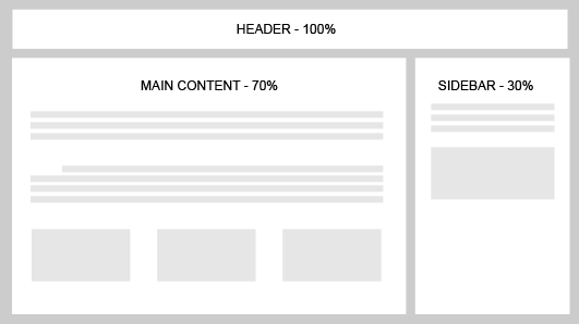
The first step to making a website responsive is to switch from fixed widths to fluid widths. This allows the web page to expand and contract with the browser since its percentage based.
For example, if the width of your old website is 1024 pixels, it will now be 100 percent so it spans across the entire web page no matter the width of the browser.
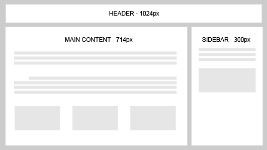
Here is an example of the conversion from fixed widths to fluid widths. As you can see we convert all the width to percentages which allow the web page to scale.
Responsive Images
The second piece of responsive web design is responsive images. Making your images responsive is a very important step because it can affect both your websites speed and its search engine friendliness.
Responsive Images grow and shrink with a user’s browser to fit the web page. If you use a very large image (both in file size and pixels) then it will take a long time to load on a device that’s connected to 3G or slower.
Adaptive Images
The most popular way to make your images responsive is to have adaptive images. Adaptive Images set a 100 percent to your images (just like the fluid layout) allowing it to adapt to its parent container.
Although this is the most popular method, it is not 100% full proof. The issue with adaptive images is that you are only showing a single image and resizing it based on the browser width.
As we stated before, this can cause some problems with site speed if your images are too large.
HISRC
This method uses Javascript to show different sized images based on the connection of the user. If the user is on a slow connection, HISRC will show a lower resolution photo that will load faster.
Media Queries
Along with fluid layouts and responsive images, media queries are required to have a responsive website. Media queries allow you to add device specific rules for hiding, growing, moving or showing content to allow for a better user experience.
Using CSS, Media Queries allow for different user interfaces for each device.
For example, let’s say you have a button on your website but you want to hide it when the visitor is viewing on a mobile device. With a small piece of code you can do this:
/* Smartphones (portrait and landscape) ----------- */
@media only screen and (min-device-width : 320px) and (max-device-width : 480px) {
/* Styles */
.button {display:none}
}
Having a responsive website is a necessity. More visitors are browsing websites from mobile devices so it’s important your website looks good or they will leave. Converting your website to responsive can be a large task for some small businesses but if you follow this post, you can have a website that works on any device.